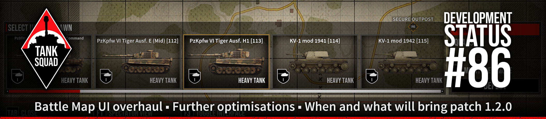
Development Status #86Fri, 30 January 2026
 Dear Tankers!
Welcome to our 86th Development Status.
Another development status update this month. We would like to share with you what has been happening with us recently.Optimization and bug fixes progressWe've nailed down a few more areas of the game where optimization is possible. Some of following have been already done, some still to do:
- infantry animations when more than 100-200 can take 5-10 ms. We already have an asset that should help us here and we will optimize it
- VFXs - it turned out each burning tank or tank shot or tank dust from exhaust was staying forever on the scene - taking up precious CPU computations where it was no longer needed
- dead infantry - the same, some calculations were still active long after infantry was dead
- vehicles displaying maximum tracks details even very far away if we had max zoom on
- various memory issues that caused the game to use more RAM than needed
There were a lot of other small improvements and in the end the game runs better and is more stable. The last big issue standing is netcode optimization, as the amount of stuff each player sends and receives still uses too much CPU. We need to take care of it before the next patch.
Watch YouTube VideoOverall we're fixing and progressing everywhere, especially we want the enemy AI and our AI to work better. To react accordingly to the situation, use less CPU when static and guarding etc. We're reaching an optimization wall here so AI must be correctly utilized and not just be there standing and watching as they can't move.
Further UI overhaulLet me tell you what we have been doing during the last, weeks, days and nights.
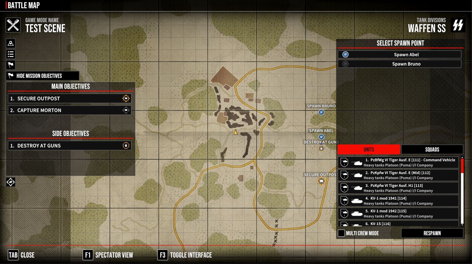
As for the interface, work is continuing to improve the appearance, clarity and functionality of the panels and their elements. After completing work on the main menu, the idea arose to try to redesign the Battle Map.
The first idea was to make the mission map full-screen so that you could have a better overview of the scenario and plan your troops' tactical movements, especially since we will be adding the ability to issue orders on the map in the future. In the previous form, when the map was a small square in the middle of the screen, this would not have been convenient.
Additional aspects, small details that make a difference, are that the margins at the edges of the screen have been reduced, so that the panels can be made slightly smaller and the information displayed is not so overwhelming. The idea is to apply the principle of 'less is more' to try to remedy the chaos in the UI - this applies to changes in the game's UI in general, not just in this panel.
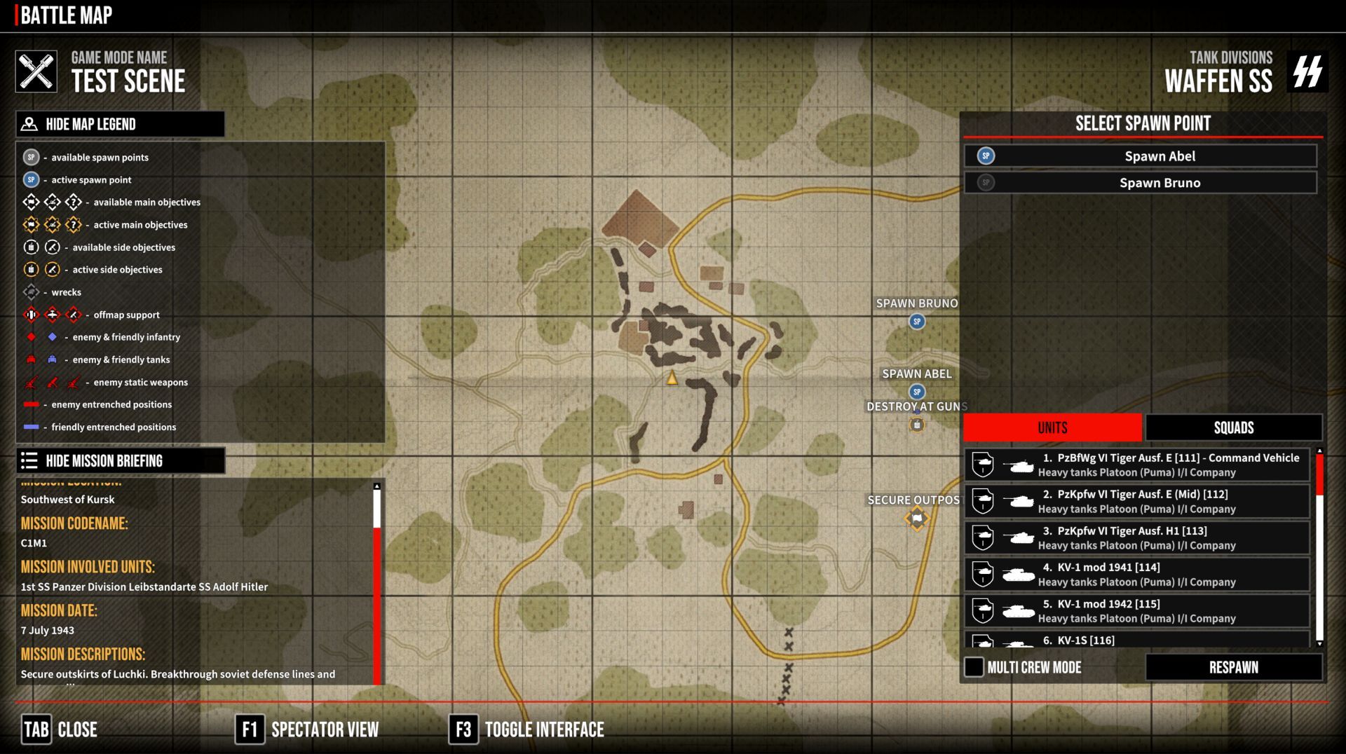
I started by redesigning the left side of the screen, hiding the panels with the legend and mission description. They can be closed and opened at any time, allowing you to see the map unobstructed. In the photo above, the right panel has not been touched yet. The buttons that correspond to the connections have animations and are interactive. When you hover over the icon, text appears with information about what the panel is - we don't need to see the panel name all the time. Similarly, on the left side, we have information typically related to the mission, the name of the game mode or the name of the scenario, and on the right, we have information typically related to the battle, i.e. what tactical unit we are operating, what forces and units we have, and what troops we have at our disposal.
Watch YouTube VideoThe plan is to make the icons on the map, e.g. respawn markers, interactive. For example, clicking on the Abel point on the map rather than in the list will mark it as a respawn point. Similarly, clicking on a vehicle that operates in Multi Crew mode, for example, will open a small menu next to it with a selection of slots in the tank, allowing you to respawn inside it.
These are, of course, plans, but they are slowly becoming a reality. Perhaps further development of this topic will be included in the new roadmap as soon as we finish the current one. At the moment, we have a lot of work to do on optimisation, with the new campaign in Ponyri, and I myself have to continue working on Ferdinand.
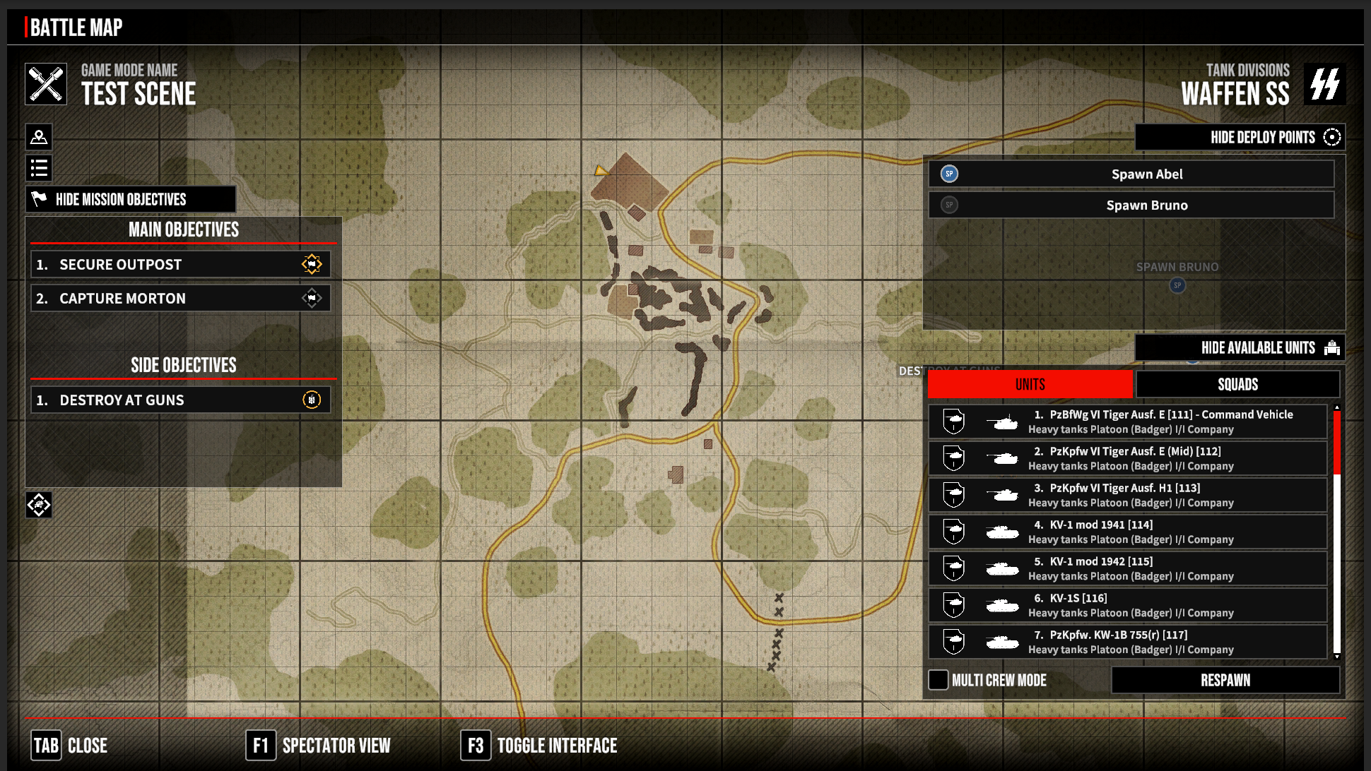
Let's go back to the changes and what has been happening in the UI over the last few days. The next step was to tackle the right panel. I started by adapting it to the new style, making it interactive and allowing the panels to be hidden separately. That is, the respawn points and available units.
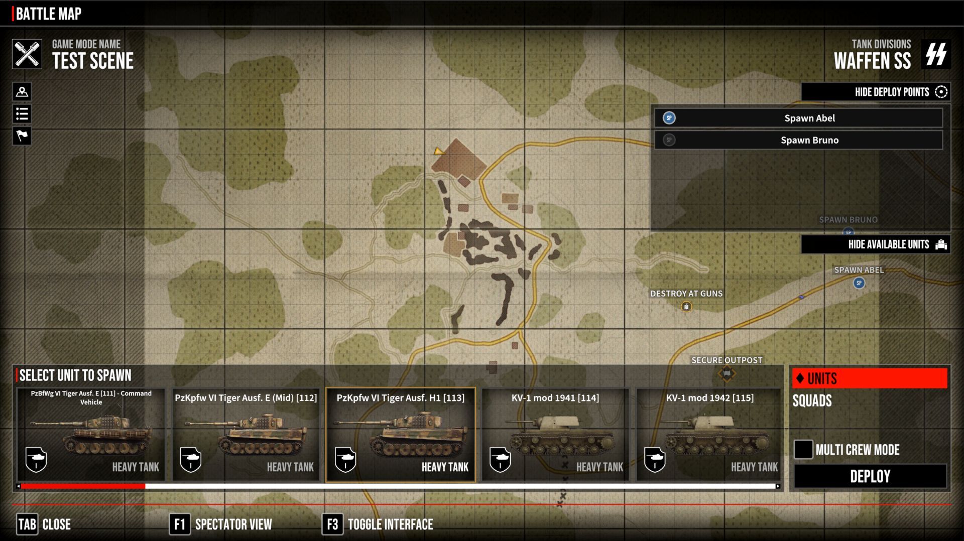
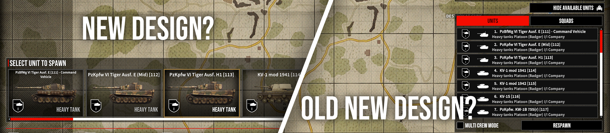
The next experiment was to create new tank icons and replace the white ones. The white icons worked well on smaller UI elements. Since the new ones look better on a larger scale, the idea arose to try something new, and so we are currently testing and playing around with versions where there is a panel at the bottom with a selection of units. There is also a little less information here, the main important information being
- what kind of unit it is
- its icon/something that represents its appearance
- which unit it belongs to, if applicable; here, simplicity is key, there is no unit name, which can be long, we don't need it here
- the emblem is enough
- the type of vehicle, whether it is a heavy tank, a light tank or, say, a truck
We won't show the appearance of the unit selection because I don't have a corrected version and the current one looks terrible. The current element also has too much information.
What do you think about this concept? Which is better? Give us your opinion in comments

Thank you and have a good weekend!
DeGenerals


 Translations for our friends around the world.
 Topic: Tank Squad Tactical WW II Realtime. (Read 34056 times)
 Similar topics (5)


